WORKS OF ART

By installing a number of art works in Maison de la paix, the Institute makes plain its support for contemporary art while adding to the building’s attraction and offering both employees and visitors something to reflect on, to discuss, and to inspire them.

The selection process was entrusted to a jury of leading experts made up of the following persons:

  • Jacqueline Burckhardt | Editor at the review Parkett
  • Loa Haagen Pictet | President of the jury and Curator of the Pictet Collection
  • Simon Lamunière | Art Expert and Exhibition Curator, Interversion
  • Françoise Ninghetto | Assistant Director, Musée d’art moderne et contemporain (Mamco) of Geneva
  • Ignacio Dahl Rocha | Architect, Richter Dahl Rocha & Associés
  • Adam Szymczyk | Director, Kunsthalle Basel

Working with preliminary projects submitted by eighteen international artists, the jury recommended six proposals. The Institute eventually selected works by the following artists:

  • Peter Kogler
  • Matt Mullican
  • Monika Sosnowska

The jury also proposed works by Superflex and William Kentridge that had not been designed specifically for their display locations. In addition, Pierre Mirabaud, former partner at Mirabaud & Cie, donated an engraving by Franz Gertsch to the Institute.


PETER KOGLER

Peter Kogler, Untitled, 2013, digital print on carpet, digital print on glass, dimensions variable

PETER KOGLER
 

1959, lives and works in Vienna
In front of Auditorium Ivan Pictet

Peter Kogler is an Austrian artist who first gained attention on the international art scene in the 1980s. His work adopts an approach based on architecture, cinema and the new digital media, as well as the major art trends of Minimalism and Pop Art.Using the computer to create his motifs, Kogler reinvents the idea of the fresco and decorative wallpaper in a more global architectural perspective. It is in fact a profound blend of inspirations drawn from the corporal and figurative domains that gives rise to the artist’s motifs, which are often quite clear in meaning and immediately recognisable, such as ants, pipes or the brain.Here, as part of the project for Maison de la paix, the artist has chosen the honeycomb as his motif. This group of hexagonal cavities or energy cells stretches, warps, expands or curls up according to the forces exerted on the structure – a network that goes on infinitely, plunging the viewer into an unsettling visual experience that seems to exist between real and fictional space. The forms produced, now convex, now concave, offer a vision in three dimensions whose dense fabric looks like an undulating weft of coiling lines.Covering the floor and walls of the same structure, Kogler’s spatial intervention fascinates thanks to the new identity it bestows on the site, shifting the borders between a real space and an immaterial architecture. Introducing a slight destabilisation into the physical perception of a place reminds anyone who ventures there of just how much each of us is a protagonist in a world in motion.

MATT MULLICAN

Matt Mullican, Plates Project, 2013, transfer printing on ceramic, dimensions variable

MATT MULLICAN


1951, lives and works in New York and Berlin 
Cafeteria


For several decades now, Matt Mullican, a native of California, has been developing a body of work that is rooted in a system for categorising experience that ranges from subjectivity to pure objectivity. This system of codified signs and colours constitutes a coherent alternative world, a cosmology, through which Mullican explores possible modes of representation linked with the collective or individual perception of reality. He associates five colours with five fundamental concepts: green evokes material reality, red subjective and spiritual values, yellow conscious manifestations of the arts and sciences, blue the mysteries of the unconscious, and black language. His pictogrammes are inspired by multiple sources (contemporary communications, archaic civilisations or personal motifs), and their interpretation varies according to the support, format and context. By turns the artist plays the part of the ethnologist, psychoanalyst, philosopher, architect, urban planner, even high priest of a virtual civilisation akin to ours. The viewer, on the other hand, must take on the role of an explorer, decipherer, interpreter…
Mullican’s project for Maison de la paix involves three sizes of plates displaying one of forty different pictogrammes which are bordered in a certain order by one of the artist’s five colours. Thanks to the normal day-to-day circulation of the plates, users of the cafeteria can discover almost countless combinations of meaning, adding cerebral and spiritual nourishment to their meal.

Assiettes

MONIKA SOSNOWSKA

Monika Sosnowska, Façade, 2010, painted steel, 515 x 145 x 220 cm

MONIKA SOSNOWSKA


1972, lives and works in Warsaw 
In front of the Institute’s reception


A fragment of the metal structure from the façade of a modernist Polish building of the 1960s has been turned into a novel and surprising form. Once reworked by the Polish artist Monika Sosnowska, this relic of the ideal architecture of classic modernism is transformed into an object that is freely suspended in space, nearly negating its 750 kg of mass through its sheer grace, looking like a skin or an elegant fabric that has an almost sensual aspect. 

The new life of this structure, which speaks a language of the past, coexists and resonates with the contemporary building that is home to Maison de la paix, offering not only a surprising spatial sensibility but also a possible dialogue on the state of architecture and culture in general.

Springing from the deconstruction of a past world, Sosnowska’s Façade conveys as well the suggestion of a new potential construction.

SUPERFLEX

Superflex, You Can’t Eat Identity/200 Euro, 2015, acrylic on canvas, 120 x 180 cm

SUPERFLEX
 

Collective of artists, founded in 1993, based in Copenhagen 
Restaurant de la Maison de la paix


You Can’t Eat Identity/200 Euro forms part of a series of seven paintings all declining the same text, “You can’t eat identity”, in each of the colours of euro banknotes. The text refers to the inhabitants of Mayotte, situated between the Mozambique Channel and the Indian Ocean, who chose to remain part of France when the other three islands of the Comoros archipelago gained independence in 1975. In 2011, following several referenda, Mayotte acquired the status of a French overseas department. Since 2014 it has officially been part of the European Union with outermost region status, becoming a target for illegal migrant trafficking.

In 2014, when the French State invited Superflex to Mayotte to work on an artistic project for the local hospital, the artists asked the inhabitants why they had chosen to become French. “You can’t eat identity” was one of the answers. The inhabitants of Mayotte have chosen French and European citizenship because identity or independence do not, in themselves, put food on the table.

This painting, along with the other six in the series, formed part of the “You Can’t Eat Identity” exhibition, centering on migration and dreams of elsewhere, which also included a video projection, European Union Mayotte.

WILLIAM KENTRIDGE

Long, Long, Long Live the 4 Modernisations & Good Vegetables & Exemplary Deeds, 2014, India ink, red pencil, digital print on paper

WILLIAM KENTRIDGE


1955, lives and works in Johannesburg 
Auditorium Ivan Pictet


“I am interested in a political art, that is to say, an art of ambiguity, contradiction, uncompleted gestures and uncertain endings – an art that keeps optimism in check and nihilism at bay.”

William Kentridge is an actively engaged and internationally recognised South African artist. His favourite subjects are history and its evolution, the systems of power and authority, memory and forgetting.
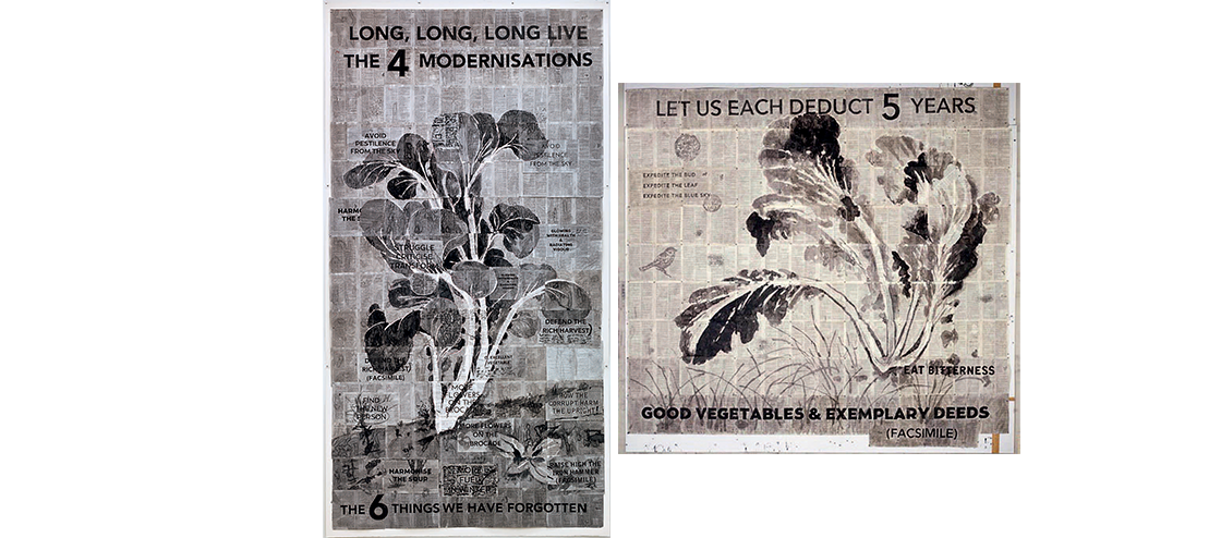
Clearly at home in the Ivan Pictet auditorium, these two monumental drawings introduce a subtle universe, both organic and literary, embracing the history of Chinese authoritarian regimes but apprehended from the point of view of a contemporary artist from another continent.

At first glance, they present themselves to the spectator as very beautiful ink drawings, representing plants. But the spectator’s delight rapidly gives way to questioning the crossing of genres between drawing, text and medium, in this case book pages. By decomposing the piece, juxtaposing pages in the manner of a mosaic, Kentridge affixes his work to existing knowledge in the seeming form of a Chinese encyclopaedia, a collection of facts and knowledge existing within a precise temporality. The artist portrays well-known motifs from erudite 14th-century paintings of vegetation and vegetables simultaneously with elements from scripture and fragments of sentences in English which oscillate between ancient parables and parodies of Chinese Cultural Revolution political slogans.

In LONG, LONG, LONG LIVE THE 4 MODERNISATIONS, the artist refers to Mao Zedong’s “modernisation” campaign, the Great Leap Forward, in which he gathered the Chinese in a struggle against the “Four Pests” – flies, mosquitos, rats and sparrows – which composed, according to the Maoist regime, a threat to the country’s crops. The campaign launched to eradicate millions of sparrows resulted notably in an invasion of crickets that contributed to the greatest famine known in China between 1958 and 1961. The other slogans, such as “HARMONISE THE SOUP”, “GLOWING WITH HEALTH & RADIATING VIGOUR”, “STRUGGLE, CRITICISE, TRANSFORM”, simultaneously contain all the paradoxes of revolutionary optimism and the ironical criticism of the Maoist authoritarian system’s setbacks and its utopian dream.

Like an echo, GOOD VEGETABLES & EXEMPLARY DEEDS – LET US EACH DEDUCT 5 YEARS welcomes, like a semitransparent spectre, a rescued bird, while in the opposite angle the text “EAT BITTERNESS” resonates, bitterly evoking the scale of the famine.

FRANZ GERTSCH

Franz Gertsch, Rüschegg I, 1988–1989, woodcut engraving on Kumohadamashi paper, 234 x 181 cm/276 x 217 cm

FRANZ GERTSCH 
 

1930, lives and works in Bern 
Kathryn and Shelby Cullom Davis Library 


Franz Gertsch transcends the frozen moment of photography, infuses it with life and immortalises it in one and the same gesture, the gesture of painting. In 1969, at the age of thirty-nine, Gertsch laid down the protocol for his work. His painting would be modeled on the objective reality furnished by the still camera. 

The meticulous description of details, the attention lavished on colours and materials, and the sheer length of time that goes into executing a piece liken his art to the work of Renaissance painters. On the other hand, his choice of subjects, the angle of the composition and the use of a photograph as a model to work from ground his practice in a post-photographic esthetic that was also inspiring American artists of the hyperrealist school during this same period. 

Interpreting in his way the upheavals affecting consumer society, Gertsch invented a timeless painting that captures a moment of keen intensity. Depictions of groups and lived scenes filled his immense canvases into the 1980s. 

In 1986 Gertsch turned a page and began a new chapter by taking up xylography, or wood engraving. He revived the ancestral technique of pricking but in a novel way, making tiny incisions in a wood panel – the artist works in monumental formats – to create a network of more or less dense points that reveal the subject through a gradual removal of material. The undertaking, which culminates in printing the image on huge pieces of Japan paper especially produced by a master papermaker in Kyoto, is imbued with an exceptional character. It requires several months of working the wood, and continues in the long and painstaking process of pulling the print. Gertsch initially focused his compositions on natural elements, then human faces, whose monumental proportions liken them to imposing icons. Centered on the protracted contemplation of the subject, the work demands prodigious concentration on the part of the artist. 

A well-known figure of international hyperrealist painting, Franz Gertsch has built up an oeuvre that is wholly a reflection on the time needed for an image to emerge.